Both look good; they do not do the same job. The decision follows viewing distance and surface.
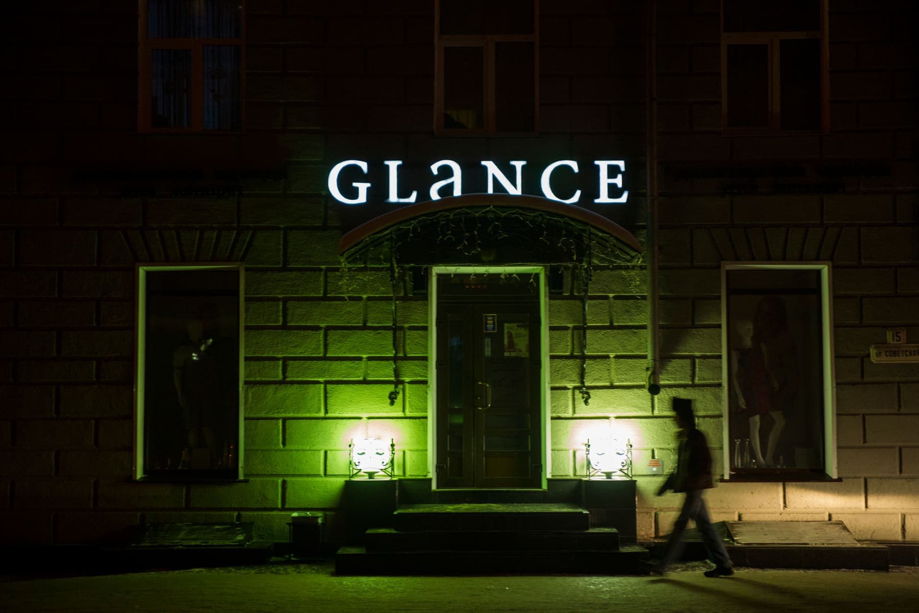
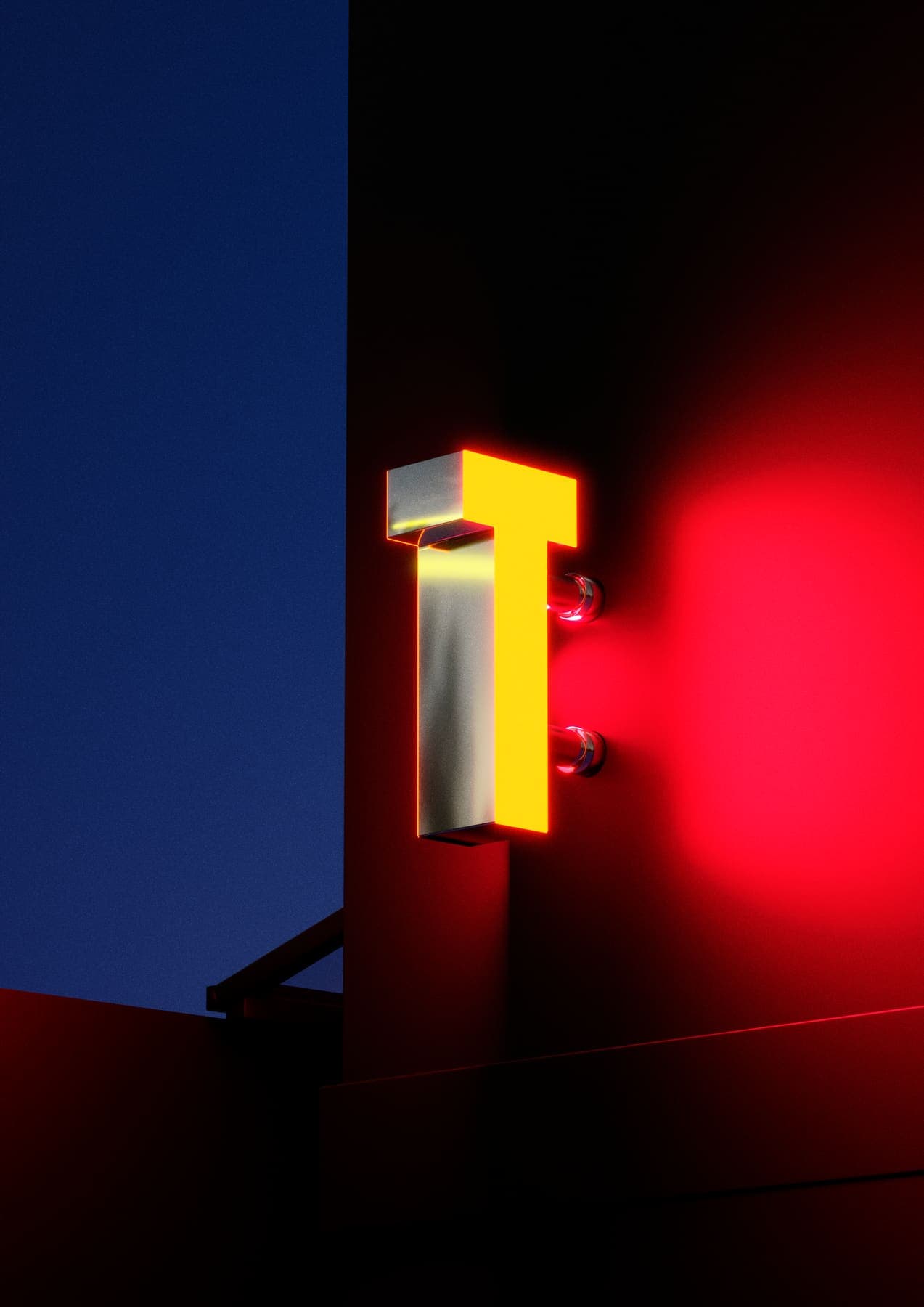
Channel letters exist to be read from a distance. Broad faces spread light evenly and carry a brand at 30–60 metres.
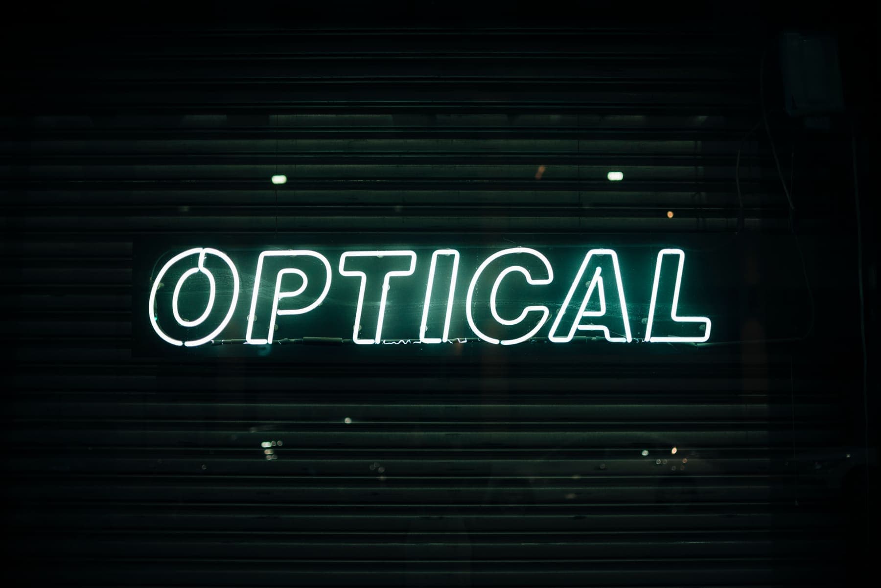
Neon exists to be felt up close. It is linear, loves fine detail and gives character at 3–10 metres.
Practical rule: channel letters outside, neon inside. But neon just behind the window glass can outperform channel letters on a narrow frontage.
The other deciding factor is budget. Neon often looks cheaper for the same legibility, but falls short at distance — and you end up buying a second sign.
When you cannot decide, the answer is usually both: legibility outside, atmosphere inside.